Sandbox: Difference between revisions
Jump to navigation
Jump to search
| Line 3: | Line 3: | ||
by Max Fisher, ''Washington Post'', WorldViews blog, 13 January 2014 | by Max Fisher, ''Washington Post'', WorldViews blog, 13 January 2014 | ||
Fisher's original 40 maps (posted August 12, 2013) | This post gives 40 remarkable data maps. They are a sequel to | ||
Fisher's original 40 maps (posted August 12, 2013) [http://www.washingtonpost.com/blogs/worldviews/wp/2013/08/12/40-maps-that-explain-the-world/?lines here]. | |||
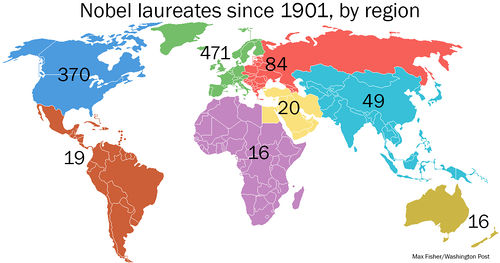
[http://www.washingtonpost.com/blogs/worldviews/wp/2013/10/15/the-amazing-history-of-the-nobel-prize-told-in-maps-and-charts/ The amazing history of the Nobel Prize, told in maps and charts] (15 October 2013). | [http://www.washingtonpost.com/blogs/worldviews/wp/2013/10/15/the-amazing-history-of-the-nobel-prize-told-in-maps-and-charts/ The amazing history of the Nobel Prize, told in maps and charts] (15 October 2013). | ||
<center>[[File:Nobels-by-region2.jpg | 500px]]</center> | |||
Submitted by Paul Alper | Submitted by Paul Alper | ||
Revision as of 21:25, 24 January 2014
Maps that explain the world
40 more maps that explain the world
by Max Fisher, Washington Post, WorldViews blog, 13 January 2014
This post gives 40 remarkable data maps. They are a sequel to Fisher's original 40 maps (posted August 12, 2013) here.
The amazing history of the Nobel Prize, told in maps and charts (15 October 2013).

Submitted by Paul Alper