Chance News 88: Difference between revisions
mNo edit summary |
|||
| Line 142: | Line 142: | ||
This essay--subtitled "Why do people love to say that correlation does not imply causation?"--explores the origin of the phrase, and some pushback against its reflexive use in online debates. | This essay--subtitled "Why do people love to say that correlation does not imply causation?"--explores the origin of the phrase, and some pushback against its reflexive use in online debates. | ||
==Is someone cooking the unemployment numbers== | ==Is someone cooking the unemployment numbers?== | ||
[http://economix.blogs.nytimes.com/2012/10/05/explaining-the-big-gain-in-job-getters/ Taming volatile Raw Data for Jobs Reports], Catherine Rampbell, The New York Times, October 5, 2012. | [http://economix.blogs.nytimes.com/2012/10/05/explaining-the-big-gain-in-job-getters/ Taming volatile Raw Data for Jobs Reports], Catherine Rampbell, The New York Times, October 5, 2012. | ||
Revision as of 21:12, 10 October 2012
Quotations
"If you are a passenger on a plane and the pilot tells you he has a faulty map, you get off the plane; you don’t stay and say 'well, there is nothing better.' But in economics, particularly finance, they keep teaching these models on grounds that 'there is nothing better,' causing harmful risk-taking."
Forsooth
“Odds of becoming a top ranked NASCAR driver: 1 in 125 billion.”
(There are only about 7 billion people in the world, so if there are only two “top ranked drivers” then the odds are only 1 in 3.5 billion or so.)
Submitted by Marc Hurwitz
Impact and retract
As unlikely as it may seem, there are many thousands (!) of health/medical journals published each month. Obviously, some carry more clout than others when it comes to promotion and reputation of contributing authors. Those journals are said to have high “impact factors.” The de facto and default definition of IF, according to Wikipedia “was devised by Eugene Garfield, the founder of the Institute for Scientific Information (ISI), now part of Thomson Reuters. Impact factors are calculated yearly for those journals that are indexed in Thomson Reuters Journal Citation Reports.”
The calculation of IF is a bit involved:
In a given year, the impact factor of a journal is the average number of citations received per paper published in that journal during the two preceding years. For example, if a journal has an impact factor of 3 in 2008, then its papers published in 2006 and 2007 received 3 citations each on average in 2008. The 2008 impact factor of a journal would be calculated as follows:
- A = the number of times articles published in 2006 and 2007 were cited by indexed journals during 2008.
- B = the total number of "citable items" published by that journal in 2006 and 2007. ("Citable items" are usually articles, reviews, proceedings, or notes; not editorials or Letters-to-the-Editor.)
- 2008 impact factor = A/B.
(Note that 2008 impact factors are actually published in 2009; they cannot be calculated until all of the 2008 publications have been processed by the indexing agency.)
Of course, when there is an “A over B” you can be sure that some journals might be tempted to inflate A and/or lower B to obtain a higher IF.
A journal can adopt editorial policies that increase its impact factor. For example, journals may publish a larger percentage of review articles which generally are cited more than research reports. Therefore review articles can raise the impact factor of the journal and review journals will therefore often have the highest impact factors in their respective fields. Journals may also attempt to limit the number of "citable items", ie the denominator of the IF equation, either by declining to publish articles (such as case reports in medical journals) which are unlikely to be cited or by altering articles (by not allowing an abstract or bibliography) in hopes that Thomson Scientific will not deem it a "citable item". (As a result of negotiations over whether items are "citable", impact factor variations of more than 300% have been observed.)
Then, there is “coercive citation”
in which an editor forces an author to add spurious self-citations to an article before the journal will agree to publish it in order to inflate the journal's impact factor.
The pressure on a researcher to publish in high IF journals according to Björn Brembs is extremely high:
As a scientist today, it is very difficult to find employment if you cannot sport publications in high-ranking journals. In the increasing competition for the coveted spots, it is starting to be difficult to find employment with only few papers in high-ranking journals: a consistent record of ‘high-impact’ publications is required if you want science to be able to put food on your table. Subjective impressions appear to support this intuitive notion: isn’t a lot of great research published in Science and Nature while we so often find horrible work published in little-known journals? Isn’t it a good thing that in times of shrinking budgets we only allow the very best scientists to continue spending taxpayer funds?
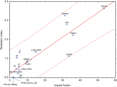
Ah, but Brembs then points out that as plausible as the above argument is regarding the superiority of high IF journals, the data do not support that statement. He refers to an article by Fang and Casadevall from which he obtains this stunning regression graph:

The retraction index is the number of retractions in the journal from 2001 to 2010, multiplied by 1000, and divided by the number of published articles with abstracts. The p-value for slope is exceedingly small and the coefficient of determination is .77. Thus, “at least with the current data, IF indeed seems to be a more reliable predictor of retractions than of actual citations.” He reasons that
If your livelihood depends on this Science/Nature paper, doesn’t the pressure increase to maybe forget this one crucial control experiment, or leave out some data points that don’t quite make the story look so nice? After all, you know your results are solid, it’s only cosmetics which are required to make it a top-notch publication! Of course, in science there never is certainty, so such behavior will decrease the reliability of the scientific reports being published. And indeed, together with the decrease in tenured positions, the number of retractions has increased at about 400-fold the rate of publication increase.
Discussion
1. Obtain a (very) good dictionary to see how the grammatical uses of the word “impact” has differed down through the centuries with a shift taking place somewhere in the post-World-War-II world. Ask an elderly person for his view of “impact” as a verb let alone as an adjective. Do the same for the word “contact” which had a grammatical shift in the 1920s.
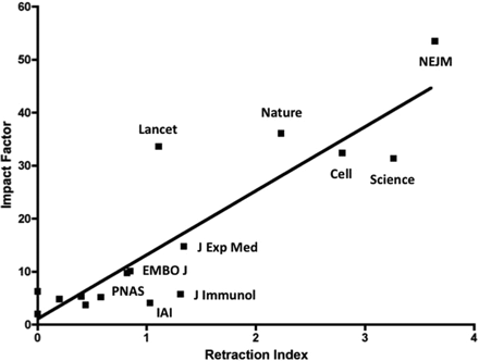
2. The Fang and Casadevall paper had the graph presented this way:

Why is Brembs’ version more suggestive of a cause (IF) and effect (retraction index) relationship?
3. Give a plausibility argument for why many low-level IF journals might have a virtually zero retraction index.
4. For an exceedingly interesting interview with Fang and Casadevall see Carl Zimmer’s NYT article.
Several factors are at play here, scientists say. One may be that because journals are now online, bad papers are simply reaching a wider audience, making it more likely that errors will be spotted. “You can sit at your laptop and pull a lot of different papers together,” Dr. Fang said.
But other forces are more pernicious. To survive professionally, scientists feel the need to publish as many papers as possible, and to get them into high-profile journals. And sometimes they cut corners or even commit misconduct to get there.
Each year, every laboratory produces a new crop of Ph.D.’s, who must compete for a small number of jobs, and the competition is getting fiercer. In 1973, more than half of biologists had a tenure-track job within six years of getting a Ph.D. By 2006 the figure was down to 15 percent.
The article is packed with intriguing discussion points about funding and ends with Fang’s pessimistic/realistic lament:
“When our generation goes away, where is the new generation going to be?” he asked. “All the scientists I know are so anxious about their funding that they don’t make inspiring role models. I heard it from my own kids, who went into art and music respectively. They said, ‘You know, we see you, and you don’t look very happy.’ ”
Submitted by Paul Alper
Poker: Skill or luck?
Poker is more a game of skill than of chance, a judge rules
by Mosi Secret, New York Times, 21 August 2012
No more bluffing
by James McManus, New York Times, 24 August 2012
This is not just a parlor debate. If poker is a game of skill rather than chance, then it cannot be regulated by laws governing gambling activity. See Chance News 46 for an earlier discussion of this topic.
To be continued...
Submitted by Bill Peterson
Where are the 47%?
The geography of the 47%
by Richard Florida, TheAtlanticCities.com, 19 September 2012
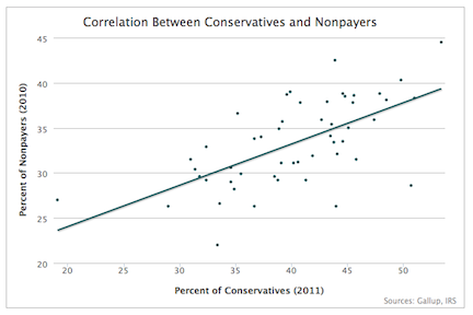
The article included the scatterplot shown below. Each point represents a state. The full version from the Atlantic (available here) is interactive: you can click on points to identify the state.
The tax data are available from the TaxFoundation.org. Note that non-payers
are defined as those who filed tax returns indicating no liability. As explained in the article, there are other nonpayers who are not required to file (which is why there are no points on the plot at 47% or more!).
Suggested by Margaret Cibes
The sexiest job
Data scientist: The sexiest job of the 21st century
by Thomas H. Davenport and D.J. Patil , Harvard Business Review, October 2012
According to the article, the job title data scientist was "coined in 2008 by one of us, D.J. Patil, and Jeff Hammerbacher, then the respective leads of data and analytics efforts at LinkedIn and Facebook."
Thanks to Nick Horton, who sent this link to the Isolated Statisticians list.
Skewed polling
The skewed polls issue and why it is important
by Dean Chambers, Examiner.com, 25 September 2012
Chambers has a website, UnskewedPolls, where he reanalyzes polls published by other organizations in order to adjust for what he sees as inherent bias. A number of recent polls have shown President Obama with a lead in key swing states. Chambers challenges these results on the basis that respondents who self-identify as Democrats comprise too large a proportion of the sample. By reweighting the results to reflect what he asserts are the true party proportions among all voters, Chambers finds that most polling data actually indicate that Romney is leading. Here is one example from the article
The Gallup tracking poll, which has been over-sampled Democrats in the past, has released its latest numbers today showing President Obama leading 48 percent to 45 percent for Mitt Romney. But the non-skewed uses a sample weighted by the expected partisan makeup of the electorate, the QStarNews Daily Tracking poll [Chambers's organization], shows Romney leading over Obama by a 53 percent to 45 percent margin.
Gallup's editor-in-chief, Frank Newport, responds to this issue in a recent post, The recurring -- and misleading -- focus on party Identification (27 September 2012). He says that Gallup determines party identification as part of its surveys, asking, “In politics, as of today, do you consider yourself a Republican, a Democrat, or an independent?" Thus, rather than reflecting fixed percentages, party affiliation is itself dynamic. In other words, what Chambers interprets as an over-sampling of Democrats may instead reflect increasing support for the Democratic candidate.
Tonight Show birthday problem
It’s my birthday too, yeah
by Steven Strogatz, New York Times, 1 October 2012
We were very happy to learn that Steven Stogatz has returned to the Times with a new Opinionator series entitled Me, Myself and Math (his earlier series, The Elements of Math, appeared in 2010).
For the present piece, he has unearthed some wonderful archival video of a Tonight Show episode from 1980, in which Johnny Carson and Ed McMahon attempt to validate the famous birthday problem probability using the studio audience. Alas, Ed inadvertently leads Johnny to confuse this with the "birthmate problem" (how many people do you need in a room to have a better than even chance of matching your birthday?). They wind up asking for the birthday of an audience member seated in the front row, and are then (comically) puzzled when no one else shares that birthday. But do watch the video--a verbal description doesn't do justice to Johnny's inimitable style.
The surprising new revelation is that it was Carson himself who brought up the birthday problem! As described in the article, various retellings of the story over the years have inserted a guest mathematician/statistician whose attempt to explain the problem was derailed by the host.
The notes at the end of the article provide some great pointers to further discussion and applications of the problem.
Submitted by Bill Peterson
Correlation does not imply causation
Jeff Witmer posted this link to the Isolated Statisticians mailing list:
The Internet blowhard’s favorite phrase
by Daniel Engber, Slate, 2 October 2012
This essay--subtitled "Why do people love to say that correlation does not imply causation?"--explores the origin of the phrase, and some pushback against its reflexive use in online debates.
Is someone cooking the unemployment numbers?
Taming volatile Raw Data for Jobs Reports, Catherine Rampbell, The New York Times, October 5, 2012.
The most recent unemployment data is good, with a reported unemployment rate below 8%. That has some people upset. Many conservatives (e.g., Jack Welch, Joe Scarborough, Rick Santelli) expressed a concern that the Bureau of Labor Statistics (BLS) may have cheated in order to help get President Obama re-elected.
These criticisms ignore the fact that all of the statisticians at BLS are not political appointees, but career civil servants who have a fair amount of insulation from political pressures. Catherine Rampbell points out some issues with unemployment figures that may lead to confusion.
These numbers are always tremendously volatile, but the reasons are statistical, not political. The numbers come from a tiny survey with a margin of error of 400,000. Every month there are wild swings, and no one takes them at face value. The swings usually attract less attention, though, because the political stakes are usually lower.
Another issue is the use of seasonal adjustments. Unemployment rates do have predictable shifts based on the calendar. In particular, there is a large change in employment as younger workers leave their summer jobs and go back to college.
The Bureau of Labor Statistics adjusts its raw survey data to correct for seasonal patterns, and since a decline in employment is expected for those 20 to 24, the economists at the bureau increased the level of employment for this group in the seasonally adjusted numbers.
It's possible that the seasonal adjustment was an overadjustment.
Changes in seasonal patterns like this one can introduce more error into the headline numbers, and can at least partly explain why the overall change in household employment looked so much bigger in September than seems plausible.
Submitted by Steve Simon
Discussion
1. How can the BLS de-politicize its unemployment report?
2. How can the media de-politicize the unemployment report?
3. How well do you think the civil service system protects career civil servants from political pressures?
Citizen-Statistician blog
The Citizen-Statistican blog, subtitled "Learning to Swim in the Data Deluge" has recently been launched by Rob Gould, Mine Çetinkaya-Rundel and Andy Zieffler. Quoting from their inaugural post (26 September 2012):
We live in the Data Deluge, but we confess we still teach stats as if data were rare and easily-managed. But in this blog, we embrace the Deluge, an age where data and software are accessible and ubiquitous. The day of telling students to pay attention because Some Day This Will Be Good For You are over. This stuff is good for them NOW, and we need to show them why.
In the future, we hope to share our thoughts about teaching future data scientists, fun data sets, cool apps, exciting software. That sort of thing. It’s all about data.
