Chance News 92
March 1, 2013 to April 3, 2013
Quotations
"I've done the calculation and your chances of winning the lottery are identical whether you play or not."
Suggested by Naomi Neff (with thanks to Cynthia Slater)
"As much as it pleases me to see statistical data introduced in the Supreme Court, the act of citing statistical factoids is not the same thing as drawing sound inferences from them."
Submitted by Paul Alper
“economisting … 1. The act or process of converting limited evidence into grand claims by means of punning, multiplicity of meaning, and over-reaching. 2. The belief or practice that empirical evidence can only confirm and never disconfirm a favored theory. 3. Conclusions that are theory-driven, not evidence-based.”
quoted by Edward Tufte in his Beautiful Evidence, Graphics Press, 2006
Submitted by Margaret Cibes
"Statistics books almost always illustrate this point by drawing colored marbles out of an urn. (In fact, it's about the only place where one sees the word 'urn' used with any regularity.)
Submitted by Paul Alper
Forsooth
Two miracles of the loaves and fishes, from The Wall Street Journal ...
“The quants have arrived at the Academy [of Motion Picture Arts and Sciences]. …. The goals in making ... predictions extend beyond [Oscar night]. Dr. Rothschild [Microsoft Research economist] is testing whether surveying people online about Oscar patterns—for example, does winning best-adapted screenplay correspond with winning best picture?—is a method that can be translated to forecasting in other areas. If it works, ‘We can apply it to all sorts of other things we don't have data for,’ Dr. Rothschild said." [emphasis added]
by Carl Bialik, February 23, 2013

Submitted by Margaret Cibes
Democracy in action ...
“Resolved Question: What is the definition for zero correlation?”
“Best Answer - Chosen by Voters”
“.... Therefore, the closer the score is to 1, the stronger the correlation (or the closer the link between 2 things) and the closer the score is to 0, the weaker the correlation (or the more distant the link between 2 things). …. In summary, a zero correlation is a score which shows that there is no relationship/link between 2 things. ....
“Hope this answer helps! if it does, tell me because I'll need to explain this again to my students in a few weeks.”
Submitted by Margaret Cibes
"Ivy League Schools Accepting Even Fewer Kids."
In the online version, the title has now been changed to "Ivy League Acceptance Rates Decline", presumably in response to reader comments blasting them for poor math skills: if applications go up, the acceptance rate goes down, even though the same number of students are admitted.
Submitted by Bill Peterson
Simpson’s paradox and the ecological fallacy
The lay public tends to believe that statistics is merely a (rather dull) branch of mathematics. In fact, the discipline of statistics should be viewed as a science, as exemplified by physics, astronomy, chemistry, etc., which uses mathematics extensively and is situation dependent. In other word, the same numbers lead to different conclusion depending on the context.
Prime examples of situation dependency may be found in the discussions of Simpson’s paradox and the even more subtle phenomenon known as the ecological fallacy. A treatment of the former can sometimes be found in elementary statistics textbooks but the latter, being less intuitive, is relatively rare in textbooks but often pops up in learned discussions where the reader is warned about drawing false conclusions.
The dating of the phenomenon now known as Simpson’s paradox goes back before any of the current Chance News readers were born; the bestowing of the name, according to Wikipedia, originated much later in 1971:
Simpson's paradox (or the Yule–Simpson effect) is a paradox in which a trend [i.e., inequality] that appears in different groups of data disappears when these groups are combined, and the reverse trend [i.e., opposite inequality] appears for the aggregate data. This result is often encountered in social-science and medical-science statistics, and is particularly confounding when frequency data are unduly given causal interpretations.
The Wikipedia article has this “real-life example from a medical study comparing the success rates of two treatments for kidney stones.”
| Treatment A | Treatment B | |
|---|---|---|
| Small Stones | Group 1 93% (81/87) |
Group 2 87% (234/270) |
| Large Stones | Group 3 73% (192/263) |
Group 4 69% (55/80) |
| Both | 78% (273/350) | 83% (289/350) |
The paradoxical conclusion is that treatment A is more effective when used on small stones, [93% > 87%] and also when used on large stones, [73% > 69%] yet treatment B is more effective when considering both sizes at the same time [78% < 83%]. In this example, the "lurking" variable (or confounding variable) of the stone size was not previously known to be important until its effects were included.
In this context of kidney stones, it is clear that disaggregation makes sense and Treatment A is preferable to Treatment B despite Treatment B being better in the aggregate sense. However, if we take the same numbers but change the context to Athletic Team A and Athletic Team B who play Small and Large opponents and the only thing that determines ranking is the total winning percentage, then Athletic Team B is preferred to Athletic Team A. That is, aggregation makes sense in this scenario as it did not in the original Wikipedia presentation.
Other interesting examples are provided in the Wikipedia article. When money is at stake, as in the “Berkeley gender bias” case discussed in Wikipedia, finding a lurking (confounding) variable requires some clever slicing to find “Small” and “Large” which will reverse the inequality. The Wikipedia article also refers to the so-called “low birth rate paradox” whereby “it has been observed that babies of low birth weights born to smoking mothers have a lower mortality rate than the babies of low birth weights of non-smokers.” The paradoxical implication is that smoking helps to lower mortality of newborns. More on this below.
A different Wikipedia article has two definitions of the ecological fallacy. The first definition focuses on aggregation and disaggregation. With this definition, Simpson’s paradox is subsumed under the ecological fallacy:
An ecological fallacy (or ecological inference fallacy) is a logical fallacy in the interpretation of statistical data where inferences about the nature of individuals [disaggregation] are deduced from inference for the group [aggregation] to which those individuals belong.
The second definition spotlights the notion of correlation:
Ecological fallacy can refer to the following statistical fallacy: the correlation between individual variables is deduced from the correlation of the variables collected for the group to which those individuals belong.
Although elementary statistics textbooks do not customarily mention the ecological fallacy, it is even older than Simpson’s paradox. The term was first coined in 1950 by William Robinson but goes back to Emile Durkheim’s 1897 study of suicide. From the graph, it appears that the greater the proportion of Protestants, the greater is the suicide rate:

According to Morgenstern, the estimated rate ratio of 7.6 was probably not because suicide rates were nearly 8 fold higher in Protestants than in non-Protestants. Rather, because none of the regions was entirely Protestant or non-Protestant, it may have been non-Protestants (primarily Catholics) who were committing suicide in predominantly Protestant provinces. It is plausible that members of a religious minority might have been more likely to commit suicide than were members of the majority. Living in a predominantly Protestant area had a contextual effect on suicide risk among Catholics.
Interestingly, Morgenstern points out that Durkheim compared the suicide rates at the individual level for Protestants, Catholics and Jews living in Prussia, and from his data, the rate was about twice as great in Protestants as in other religious groups. Thus, when the rate ratios are compared (2 vs 8), there appears to be substantial ecological bias using the aggregate level data.
In the above situation there was no reversal of an inequality, merely a sharp diminishing from aggregated to disaggregated. The following example of the ecological fallacy actually illustrates the reversal.
One compelling example by Robinson (1950), was the relationship between nativity (foreign vs native born) and literacy. For each of the 48 states in the USA of 1930, [there were only 48 states admitted to the Union by 1930] Robinson computed two numbers: the percent of the population who were foreign-born (i.e. immigrants), and the percent who were literate. He found the correlation between the 48 pairs of numbers was .53. This ecological correlation suggested a positive association between foreign birth and literacy: the foreign-born (immigrants) are more likely to be literate than the native-born. In reality, the association was negative: the correlation computed at the individual level was −0.11 (immigrants were less literate than native citizens). The ecological correlation gave the incorrect inference. This is because the foreign-born (immigrants) tended to migrate to and settle in states where the native-born are relatively literate. In this example by Robinson, the correlation is totally reversed.
Robinson’s data look this way:

The following graph dealing this time with income and being foreign born is even more striking:

U.S. states with proportionally more immigrants have proportionally more households with income above $100k. Ergo, immigrants are more likely than non-immigrants to have household incomes above $100k.
Hopefully something feels off about that logic. Because it’s wrong. Actually the relationship between income and being an immigrant at the individual level is the opposite.
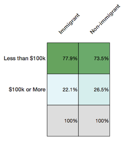
Deducing from the first chart that immigrants are more likely to be well-off is committing the ecological fallacy—attributing qualities at the individual level because of a relationship at a group level.

But here is a more recent and more difficult-to-unravel ecological fallacy:
That example was pretty easy to catch, not least because it feels intuitive that immigrants would tend to have lower income than non-immigrants.
But not all ecological fallacies are so easy to spot. For example, there’s a negative correlation between per capita income in a state and the percent of the 2012 presidential election vote that went to Romney.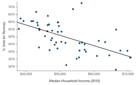
It’s easy to picture rich and liberal cities like San Francisco and New York, hear the phrase “latte liberal” a couple times, and believe that higher income is in fact correlated with voting Democratic. At an individual level, though, higher income is associated with voting Republican.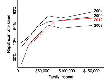
The (simplified) explanation for this apparent paradox? Across the country, lower income folk tend to vote Democrat; within blue states, upper income folk also vote Democrat, but in red states they vote Republican.


A general way to look at where the fallacy might arise is via the following graph and explanation of Durkheim’s suicide data:

That is, within every group it is possible that even if the correlation (regression line) is negative, it can happen that across the groups, the correlation (regression line) is positive. Note too that in many situations the “within” is not a cloud of points, each of which represents an individual, but instead, there is just one point, average exposure and average outcome. Further, exposure may come from one data base and outcome from another data base. This is totally unlike the kidney stones example which began this wiki because there stone and success can be tied to a particular individual.
Discussion
1. An oft-used synonym for the ecological fallacy (inferring from group to individuals) is called cross level inference. The opposite of the ecological fallacy is the atomistic fallacy (inferring from the individuals to the group).
2. With regard to Robinson’s data, besides the fallacy aspect, what is wrong with doing a correlation in the first place?
3. Concerning the graph of foreign born and income, suppose the ordinates were interchanged. How is this then similar to Durkheim’s study and its ecological fallacy?
4. The paradox of the smoking mother is supposedly explained by the following:
The birth weight distribution for children of smoking mothers is shifted to lower weights by their mothers' actions. Therefore, otherwise healthy babies (who would weigh more if it were not for the fact their mother smoked) are born underweight. They have a lower mortality rate than children who have other medical reasons why they are born underweight, regardless of the fact their mother does not smoke. In short, smoking may be harmful in that it contributes to low birth weight, but other causes of low birth weight are generally more harmful only with regard to their weight.
How does this explanation accord with the aforementioned phrase, situation dependent?
Submitted by Paul Alper
Normal vs. paranormal
John Allen Paulos sent a link to the following cartoon, reproduced below as presented on the StackExchange blog Cross Validated:

From: A visual comparison of normal and paranormal distributions
Matthew Freeman J Epidemiol Community Health 2006;60:6.
Lower caption says 'Paranormal Distribution'- no idea why the graphical artifact is occuring.
Gallup reviewing its methods
“Gallup Presidential Poll: How Did Brand-Name Firm Blow Election?”
HuffPost Pollster, March 8, 2013
The article discusses Gallup’s consistently favorable-to-Romney poll results over the Fall 2012 presidential election cycle, including a final Romney 49%-Obama 48% result. (Of course, 49 to 48 does not a winning prediction make.) It includes a nice scatterplot illustrating that the Gallup results deviated remarkably (not necessarily “significantly”) from other national polls over this period.
Apparently Gallup revised its methodology re presidential approval polling in October 2012, in order to correct an “under-representation of non-whites in its samples.” Another nice scatterplot shows how Gallup’s rating results moved more into line with other polls’ results in October of the period July 2012-January 2013.
The article also contains a somewhat detailed discussion of two serious problems facing Gallup and other pollsters today: “how they treat their ‘likely voter’ models and how they draw their samples from the general population.” These are issues associated with identifying likely voters and with reaching them by phone.
Submitted by Margaret Cibes
Naked Statistics
Charles Wheelan’s book, Naked Statistics: Stripping the Dread from the Data, is a breezy fun-filled read, his “homage to an earlier W.W. Norton classic, How to Lie with Statistics by Daryll Huff. Without my wishing to imply anything negative, a few decades back, Naked Statistics would be an ideal text for a course entitled, “Statistics for Poets.” Today, even poets, drama students, and people whose specialty is 17th century French drama (perhaps unfortunately) really need to learn some basic statistics. From the very Introduction to the book, he emphasizes his distaste for mathematics for mathematics sake: “What is the area beneath a parabola? Who Cares?” Yet, he likes physics which uses the same math “Because physics has a clear purpose.” Likewise, “I love statistics,” a comment not often seen or heard outside of Chance News.
As he puts it
The paradox of statistics is that they are everywhere--from batting averages to presidential polls--but the discipline itself has a reputation for being uninteresting and inaccessible. Many statistics books and classes are overly laden with math and jargon. Believe me, the technical details are crucial (and interesting)--but it’s just Greek if you don’t understand the intuition. And you may not even care about the intuition if you’re not convinced that there is any reason to learn it. Every chapter in this book promises to answer the basic question that I asked (to no effect) of my high school calculus teacher: What is the point of this?
The point is that statistics helps process data, which is really just a fancy name for information.
His motto is “Statistics can be really interesting, and most of it isn’t that difficult.” By the end of the book the reader is confronting regression analysis, which he calls “the miracle elixir, and in the next chapter, why it may not be. His examples vary from the amusingly bizarre to the downright practical. Naked Statistics is an ideal gift to a significant other who loves you but wonders about what you actually do with your time.
Discussion
1. On page xii he reveals “a career epiphany” he had at math camp. The math teacher was describing without any physical context that the infinite (geometric) series 1+1/2 + 1/4 + 1/8 +…converges to a finite number. Wheelan came up with the following context to make it meaningful to him: A wall is two feet away and your first move is one foot, followed by a move of 1/2 foot, followed by a move of 1/4 foot and so on until you are “pretty darn close to the wall.” What would happen to you and the wall if the infinite series was instead 1+1/2 + 1/3 +1/4 + 1/5 +1/6 + 1/7 +1/8 +…?
2. Nate Silver’s book, The Signal and the Noise, is a hymn to Bayesian statistics. Naked Statistics has no mention whatever of Bayes or Silver so that your significant other will have to do some outside reading. Wheelan promises that his second edition will include Bayesian concepts.
3. The review in the NYT put it this way:
While a great measure of the book’s appeal comes from Mr. Wheelan’s fluent style — a natural comedian, he is truly the Dave Barry of the coin toss set — the rest comes from his multiple real world examples illustrating exactly why even the most reluctant mathophobe is well advised to achieve a personal understanding of the statistical underpinnings of life, whether that individual is watching football on the couch, picking a school for the children or jiggling anxiously in a hospital admitting office.
Are you a fan of those handy ranking systems based on performance data, guaranteed to steer you to the best surgeons in town? If so, you are up to your armpits in descriptive statistics, and Mr. Wheelan has some advice for you: beware. The easiest way for doctors to game those numbers is by avoiding the sickest patients.
How do college football and basketball teams similarly game the numbers?
4. At the same NYT review there is an accompanying graphic taken from Wheelan’s book:

From the graphic, why would a (Pearson product-moment) correlation be misleading? Why the “reverse causality”?
[Note: The NYT also provided this excerpt from the book's introductory chapter.]
Submitted by Paul Alper
Miscellaneous stats news
From The Wall Street Journal:
"One [issue] is, if we see a sequence of words, how can we best guess which word is likely to come next. …. The other is how does that relate to the way a user actually interacts with their [sic] touch screen. The way we do this is essentially by modeling the surface of the keyboard as a series of probability distributions. What that means in layman’s terms is, the keyboard looks a bit like a mountain range with a peak where the user perceives each of the keys to be. We collect the points that you touch the screen, and we form and mold the mountains around those points. That gives us a unique snapshot of the way you perceive your keyboard. If we solve that problem, that gives us probabilities we can also use with the language probabilities we have, and then we tie these things together. What comes out at the end is the solution to this central mathematical problem — how do I guess what the user is trying to say.”
“The training of data scientists hasn't caught up with that demand, leaving companies searching for talent and especially, some say, for the relatively few people with extensive experience in the field. …. Tech workers with a full complement of big-data analysis skills are paid on average 11.5% more than people without those skills ….”
“Poring once more over a 12-year-old set of data on breast-cancer tumors, Dr. Lum saw correlations between the disease and patients' outcomes that she and her fellow researchers had never noticed before …. Dr. Lum's new view came courtesy of software that uses topology, a branch of math that compresses relationships in complex data into shapes researchers can manipulate and probe: in this case, a Y, like a two-eared worm. …. [R]esearchers increasingly are scouring scientific papers and esoteric branches of mathematics like topology to make sense of complex data sets. …. Using graph theory, a tool similar to topology, IBM is mapping interactions of people on social networks, including its own.”
See also the article “Big Data, Big Blunders”, March 8, 2013, as well as the 3-minute video “Birth Rate vs. Child Mortality: The River of Myths”, posted on January 29, 2013, in which Hans Rosling demonstrates in a dynamic graph "why common notions of developing vs. developed countries are no longer clear-cut," in his opinion.
Submitted by Margaret Cibes
Mediterranean diet
Mediterranean diet shown to ward off heart attack and stroke
by Gina Kolata, New York Times, 25 February 2013
Diets come and diets go: high protein, Atkins, South Beach, Dash, Weight Watchers, low carb, no carb. But then there is the perennial favorite, the so-called Mediterranean diet which has generated some recent positive publicity. According to the NYT article:
The findings, published on The New England Journal of Medicine’s Web site on Monday, were based on the first major clinical trial to measure the diet’s effect on heart risks. The magnitude of the diet’s benefits startled experts. The study ended early, after almost five years, because the results were so clear it was considered unethical to continue.
According to someone who was not connected with this study conducted from Spain,
“And the really important thing — the coolest thing — is that they used very meaningful endpoints. They did not look at risk factors like cholesterol or hypertension or weight. They looked at heart attacks and strokes and death. At the end of the day, that is what really matters.”
This randomized, open-label clinical trial “assigned 7,447 people in Spain who were overweight, were smokers, or had diabetes or other risk factors for heart disease to follow the Mediterranean diet or a low-fat one.” The low-fat diet was the control and the Mediterranean diet had two arms, one with nuts and the other with extra-virgin olive oil.
Reproduced below is a graph from the NYT article that highlights the benefits of either form of the Mediterranean diet.

The claim is that “about 30 percent of heart attacks, strokes and deaths from heart disease can be prevented in people at high risk if they switch to a Mediterranean diet.”
Discussion
1. The NEJM study itself may be found here. Its results are stated thusly:
RESULTS A total of 7447 persons were enrolled (age range, 55 to 80 years); 57% were women. The two Mediterranean-diet groups had good adherence to the intervention, according to self-reported intake and biomarker analyses. A primary end-point event occurred in 288 participants. The multivariable-adjusted hazard ratios were 0.70 (95% confidence interval [CI], 0.54 to 0.92) and 0.72 (95% CI, 0.54 to 0.96) for the group assigned to a Mediterranean diet with extra-virgin olive oil (96 events) and the group assigned to a Mediterranean diet with nuts (83 events), respectively, versus the control group (109 events). No diet-related adverse effects were reported.
2. Here are the explicit recommendations for the Mediterranean diet and the (control) low-fat diet:
Mediterranean diet
Recommended
- Olive oil(*) ≥4 tbsp/day
- Tree nuts and peanuts† ≥3 servings/wk
- Fresh fruits ≥3 servings/day
- Vegetables ≥2 servings/day
- Fish (especially fatty fish), seafood ≥3 servings/wk
- Legumes ≥3 servings/wk
- Sofrito‡ ≥2 servings/wk
- White meat Instead of red meat
- Wine with meals (optionally, only for habitual drinkers) ≥7 glasses/wk.
Discouraged
- Soda drinks <1 drink/day
- Commercial bakery goods, sweets, and pastries§ <3 servings/wk
- Spread fats <1 serving/day
- Red and processed meats <1 serving/day
Low-fat diet (control)
Recommended
- Low-fat dairy products ≥3 servings/day
- Bread, potatoes, pasta, rice ≥3 servings/day
- Fresh fruits ≥3 servings/day
- Vegetables ≥2 servings/wk
- Lean fish and seafood ≥3 servings/wk
Discouraged
- Vegetable oils (including olive oil) ≤2 tbsp/day
- Commercial bakery goods, sweets, and pastries§ ≤1 serving/wk
- Nuts and fried snacks ≤1 serving /wk
- Red and processed fatty meats ≤1 serving/wk
- Visible fat in meats and soups¶ Always remove
- Fatty fish, seafood canned in oil ≤1 serving/wk
- Spread fats ≤1 serving/wk
- Sofrito‡ ≤2 servings/wk
(*)The amount of olive oil includes oil used for cooking and salads and oil consumed in meals eaten outside the home. In the group assigned to the Mediterranean diet with extra-virgin olive oil, the goal was to consume 50 g (approximately 4 tbsp) or more per day of the polyphenol-rich olive oil supplied, instead of the ordinary refined variety, which is low in polyphenols.
†For participants assigned to the Mediterranean diet with nuts, the recommended consumption was one daily serving (30 g, composed of 15 g of walnuts, 7.5 g of almonds, and 7.5 g of hazelnuts).
‡Sofrito is a sauce made with tomato and onion, often including garlic and aromatic herbs, and slowly simmered with olive oil.
§ Commercial bakery goods, sweets, and pastries (not homemade) included cakes, cookies, biscuits, and custard.
¶Participants were advised to remove the visible fat (or the skin) of chicken, duck, pork, lamb, or veal before cooking and the fat of soups, broths, and cooked meat dishes before consumption.
3. Why would the above recommendations be difficult to follow in some parts of the world? Google sofrito to see if you have consumed it under another name. Comment on the inexactness of the term “a serving.”
4. “Peanuts” are part of the recommendations but in the footnote, only walnuts, almonds and hazel nuts appear. Try to come up with an explanation for the exclusion of peanuts.
5. The Mediterranean while not as large as the Atlantic or the Pacific, does include North Africa as well as many European countries. If your ancestors come from one of those places, comment on how your Mediterranean cuisine heritage might differ from the above recommendations when it comes to cheese, meat, wine, butter, etc.
6. If strokes, heart attacks and death are more meaningful--as they definitely are--than surrogate criteria such as cholesterol, blood pressure and weight gain, why do so many studies look at surrogate measures only?
7. This study had 18 authors some of whom served on the board of the Research Foundation on Wine and Nutrition, received support from the California Walnut Commision, the International Nut and Dried Food Council, Nestle, PepsiCo, the Beer and Health Foundation and Danone.
8. The authors state that “Among persons at high cardiovascular risk, a Mediterranean diet supplemented with extra-virgin olive oil or nuts reduced the incidence of major cardiovascular events.” Why was no conclusion drawn regarding persons who are at low cardiovascular risk?
9. But maybe the last word on the subject of diets can be found in the NYT article. Dr. Esselstyn, a noted vegan, remarked
those in the Mediterranean diet study still had heart attacks and strokes. So, he said, all the study showed was that “the Mediterranean diet and the horrible control diet were able to create disease in people who otherwise did not have it.”
10. Let us not forget the famous phrase popular among our forbearers: when it comes to diets, there are really only two: food and no food.
Submitted by Paul Alper
The elusive definition of a p-value
Putting a value to ‘real’ in medical research
by Nicholas Bakalar, New York Times, 11 March 2013
A sidebar graphic displays the single figure 0.05 (which was the headline in the print edition).
The article begins:
When medical researchers report their findings, they need to know whether their result is a real effect of what they are testing, or just a random occurrence. To figure this out, they most commonly use the p-value.
So far, so good. Alas, in the next paragraph we find the following twisted logic:
This number (the p stands for probability) is arrived at through a complex calculation designed to quantify the probability that the results of an experiment were not due to chance.
Submitted by Bill Peterson
Using genetic data without permission
The Immortal Life of Henrietta Lacks, the Sequel, Rebecca Skloot, The New York Times, March 23, 2013.
There is a pompous attitude that some people take when they are told about research abuses. It goes along the lines of "That happened years ago, and with all of today's safeguards, it could never happen again." Well, maybe, but this article provides a healthy reminder that sometimes we don't learn from our mistakes.
Rebecca Skloot wrote an excellent book (The Immortal Life of Henrietta Lacks) about Henrietta Lacks and a line of cells (HeLa) derived from a tumor that killed her in 1951. This book is worth reading if you are involved with research because it deals with the issue of taking tissues from a person and using them for research with getting consent first. It also talks about abuses of Henrietta Lacks's family. Most of the problems occured before we had the Belmont Report and Institutional Review Boards. But recently, researchers, presumably all trained in the proper conduct of research, made a very similar mistake with the same family. Scientists sequenced and published the full genome from the HeLa cell line. They did this without seeking the consent of family members
Research on a dead person normally has few barriers and this is often reasonable. But genetic information is different because it reveals something more. Genetic information provides data not just on the dead person but on any living relatives. This is not universally appreciated, even by experts in the field.
A news release from the European Molecular Biology Laboratory, where the HeLa genome was sequenced, said, "We cannot infer anything about Henrietta Lacks’s genome, or of her descendants, from the data generated in this study."
But this data can be combined with publicly available resources to surprising results. One scientist
uploaded HeLa’s genome to a public Web site called SNPedia, a Wikipedia-like site for translating genetic information. Minutes later, it produced a report full of personal information about Henrietta Lacks, and her family. (The scientist kept that report confidential, sharing it only with me.) Until recently, few people had the ability to process raw genome data like this. Now anyone who can send an e-mail can do it. No one knows what we may someday learn about Lacks’s great-grandchildren from her genome, but we know this: the view we have today of genomes is like a world map, but Google Street View is coming very soon.
There is a growing awareness in the research community that DNA sequences, in particular, raise difficult issues that are unaddressed by current regulations.
The problem, says Yaniv Erlich, a fellow at the Whitehead Institute for Biomedical Research, is that anonymity vanishes when it comes to DNA: “People don’t realize it’s impossible to hide genetic information once it’s out there.” He and his colleagues recently proved that it’s possible to use online public databases to find the identities of people whose anonymous DNA samples had been sequenced and published online. Yet researchers aren’t required to tell you that there is no guarantee that a genome, once sequenced, will stay private or anonymous.
Discussion
1. What are some of the problems that can occur when genetic information about an individual becomes publicly available?
2. Would you consider letting your DNA sequence be openly published for the benefit of research? Would you check first with your parents, siblings, or children before doing this?
3. Can reasonable safeguards be put in place to allow distribution of gene sequence data without compromising privacy?
Submitted by Steve Simon
Snow's cholera data revisited
Rosemary Roberts sent this link to the Isolated Statisticians list:
John Snow's data journalism: the cholera map that changed the world
Guardian, datablog, 15 March 2013
There's a lot to explore here: a narrative of Snow's investigation; Edward Tufte's commentary; the Guardian's interactive recreation of the Snow's map; and a link to a spreadsheet of the actual data.